YES, THAT’S RIGHT, IT’S THE SECOND INSTALLMENT OF “UNAUTHORIZED, UNASKED-FOR REVIEWS OF OTHER PEOPLE’S WEB COPY”!
I’m your host, Lianna Patch, and you can read my analysis of Purple’s Seat Cushion Landing page right here if you haven’t already.
Today I’m gonna take you through the current iteration of Dollar Shave Club’s homepage. Like Purple, DSC first went viral with a hilarious ad:
And their branding promises punchy, masculine fun in both their marketing copy and their physical products.
But when I went through DSC’s homepage this weekend, one thing struck me: They play it pretttttty slow and safe when introducing humor into their copy.
Lemme go through why I think they’re taking it slow, since, you know, this is my blog and all.
Here’s the page I’m looking at:
Dollar Shave Club Homepage (as of January 2018)
Click to view a full-size, zoomable version of the annotated page in a new tab. Then scroll down for my thoughts on what DSC is doing, what’s working, and what’s not.
What Dollar Shave Club is doing on this page
First things first: DSC is currently using its homepage as a sales page for its Starter Sets.
There are 4 calls to action throughout the page. 3 of those link to a landing page with more options for Starter Sets, and one is a direct Add to Cart link.
There are a few reasons why DSC would choose to treat its homepage as a sales page:
- Homepages are overrated and usually poorly executed — “Let’s put everything we do right here on the homepage and make people scroll until they get bored!!11eleventy”
- DSC knows most people become customers through the Starter Set, and they want to make that acquisition easier
- They know they can more easily show value through their actual service than here on this page, so they’re gunning to get signups/sales as soon as possible.
OR MAYBE IT’S ALL 3! Or maybe there is another Mystery Reason (TM)!
We in agreement? Cool. Let’s check out the page section by section.
Section 1 (Hero: “Experience Butter with the Classic Shave Starter Set”)
The first thing you notice when you land on the homepage is the hero section video, which I ADORE.
It very quickly turns from a standard product shot (a hand reaching for shaving cream — excuse me, shave butter) to a comedic display of what using the product presumably feels like.
AKA riding a creamy Slip N’ Slide to Shave Heaven, where a distinguished older gentleman gently and sweetly blows the beard right off your scruffy face. I’ll take it.
Now, this video is our first clue that DSC is aiming to brand itself with humor.
And it’s our only clue. Because the copy in this hero section is straight-up boring by itself.
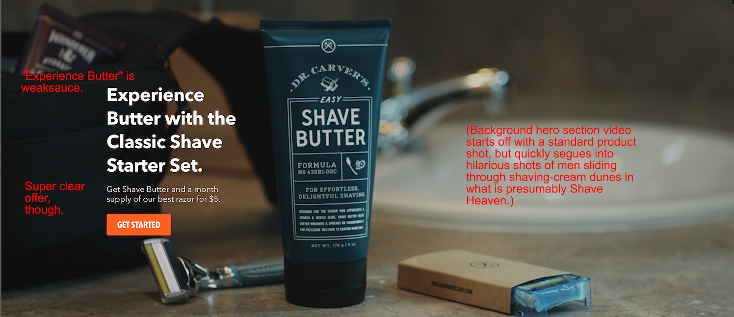
Imagine the video didn’t load when you visited this page, for one reason or another.
All you’d see is “Experience Butter [with the Classic Shave Starter Set].” What does “Experience Butter” even mean?
The subhead does a good job of explaining and clarifying the offer — “Get Shave Butter and a month supply of our best razor for $5” — but that big headline is a waste of valuable space.
Regardless of the video or image in the hero section, the copy here needs to be able to stand on its own! And right now, it’s as wobbly as a newborn fawn.

You’re welcome
Without even needing to be funny about it, DSC could have easily picked a more evocative headline; say, “Slip Into a Smoother Shave”. (Y’all can have that one. It’s free.)
So why doesn’t Dollar Shave Club go balls-to-the-wall with humor copywriting right away?
Well, because this is a homepage. They’re getting traffic from all different sources here, and not all of those visitors will know who DSC is or what they sell.
It’s better to be clear up front than potentially confusing a significant portion of that traffic — even at the risk of being boring, which the current hero section copy totally is.
Onward, noble steeds!
Section 2 (Offer: “A Starter Set is the ideal way to start”)
This section doubles down on the offer presented up top: Here’s what you get, here’s what it costs, and here’s what you’re signing up for. Pretty straightforward stuff.
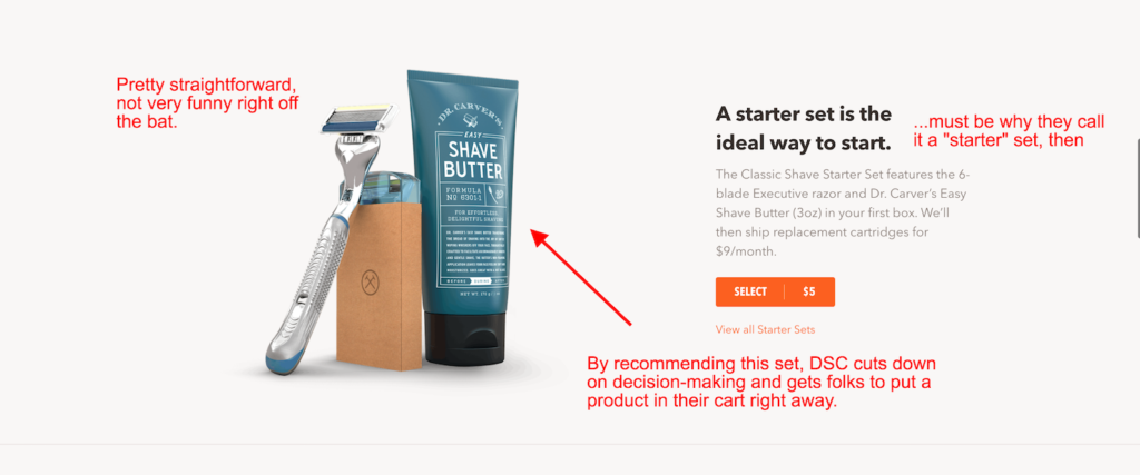
Again, there’s a wretchedly lazy header that isn’t working as hard as it could be. “A starter set is the ideal way to start.”
YOU DON’T SAY.
Quoth the Raven, “That shit was real dumb.”
To avoid this repetition (and redundancy), DSC shoulda gone with something like, “Your smoother shave starts here.” Or… “The Starter Kit is your key to a silkier shave.”
Look, I know it’s not Dickinson, but it’s better, OK?
Then we move on to a smaller section — let’s call it 2A — where readers get the deets on the Starter Kit and everything it contains month to month.
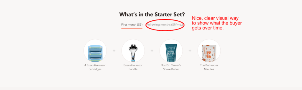
I’m not sure why there’s not more info available (like, in a hover or accordion or dropdown) about each of the included items.
Especially the Bathroom Minutes, since I’m guessing not a lot of people can intuit that that it’s a tiny, poop-pun-filled newspaper that DSC sends out with each of its cartridge refills. Why not specify?? It could be a selling point for… some people.
But OK, they want to keep the page as uncomplicated as possible. Sure. Fine. Next.
Section 3 (Benefits: “3 reasons to try DSC”)
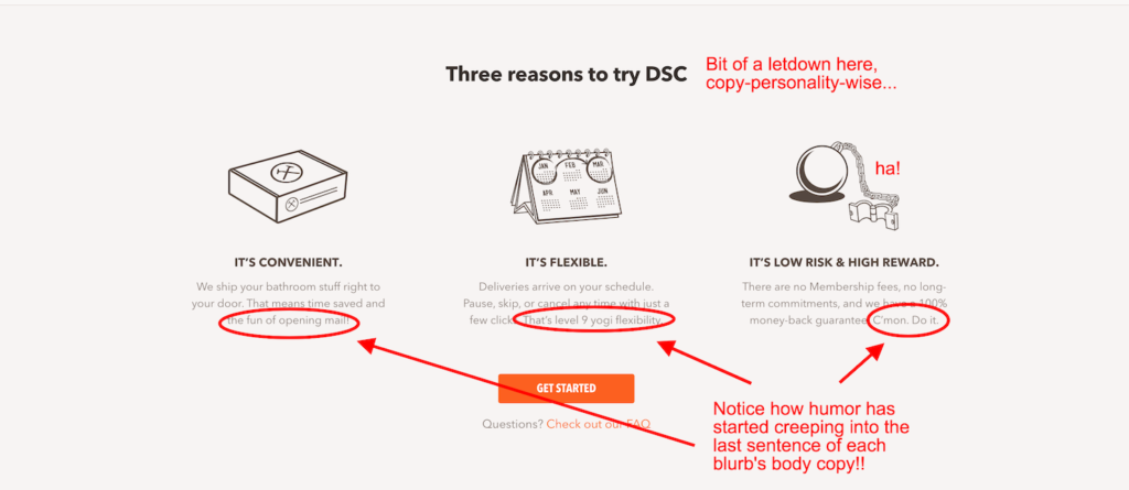
Another lazy swing and miss for this headline. Yes, it’s clear. But it’s also soooo boring.
A simple tweak could make this more persuasive — again, without even needing to inject humor:
“3 reasons to try DSC” —> “Why should I try DSC?”
Putting this header in the reader’s voice helps the copy relate to what the user is probably asking him- (or her)self at that moment.
Notice how it’s “Why should I” — not “Why should you,” which is how the original version is phrased (“3 reasons [why you should] try DSC”).

Make it about the reader, y’all
But here’s the interesting thing… this is the section where we start to see some flavor coming into the copy. Not in the headers — that might be too risky! — but in the body copy, right at the end. Just the way you might try to coax a friend into coming to a party when you know she’d rather stay at home in her footie pajamas.
We also get our first real, concrete, funny image: “level 9 yogi flexibility”.
Sadly, this is one of only three such “word pictures” that DSC paints on this page. (First person to find the other two gets a pat on the head from me and a hi-res photo of my cat lying upside down!
Actually, y’all can just have that photo now. You’re welcome.)
Such floof. Much relax!
Section 4 (The we just remembered this was a homepage, so here’s some content, we guess section: “We want more than just your body”)
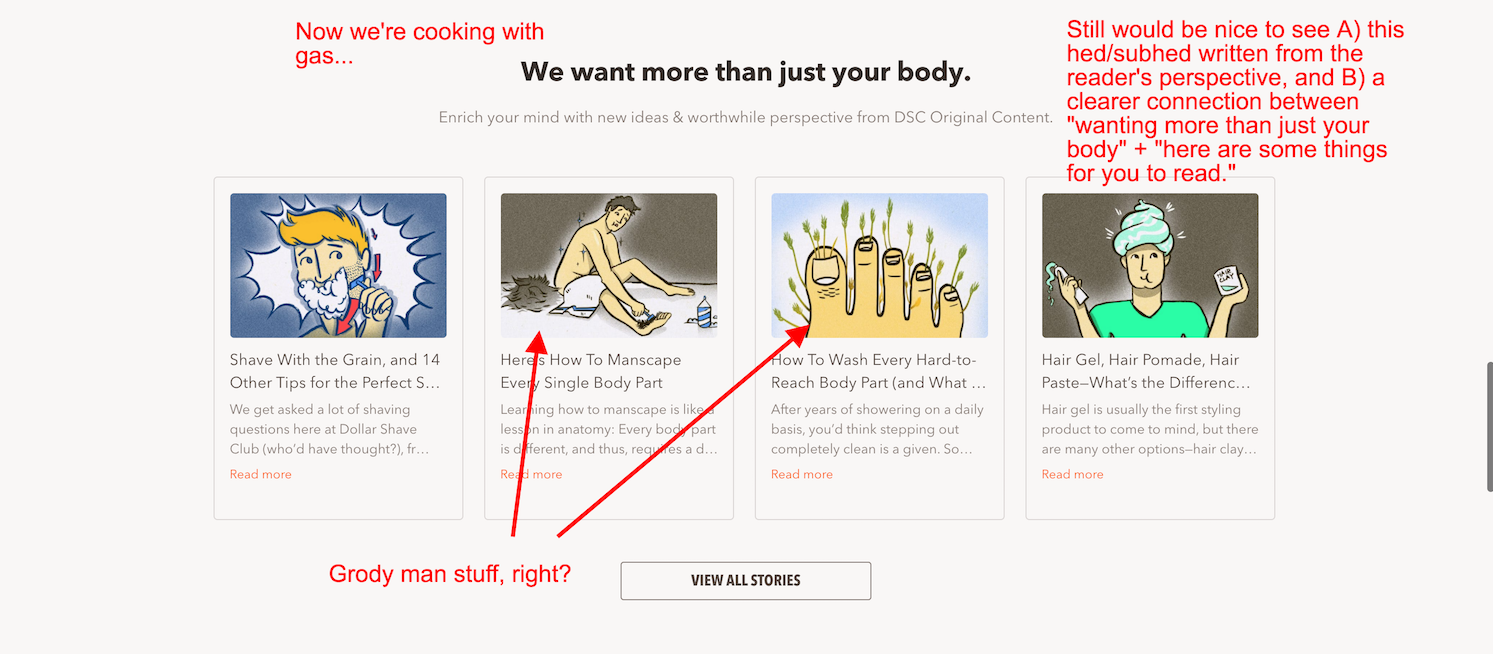
Readers who have been following the thread of this homepage might do a double-take upon getting to this section, which seems like DSC’s marketing team remembered that homepages are supposed to offer something for everyone, so they threw up a bunch of blog links.
More subpar headline and subhead writing here. “We want more than just your body” is vague, awkwardly phrased, not really about the reader, and doesn’t connect with the subhead below–which is thus given the unfair burden of explaining that hey, DSC also runs a blog.
I do like those intentionally gross blog thumbnail illustrations, though.
Section 4 (FAQ: “So what’s the catch?”)
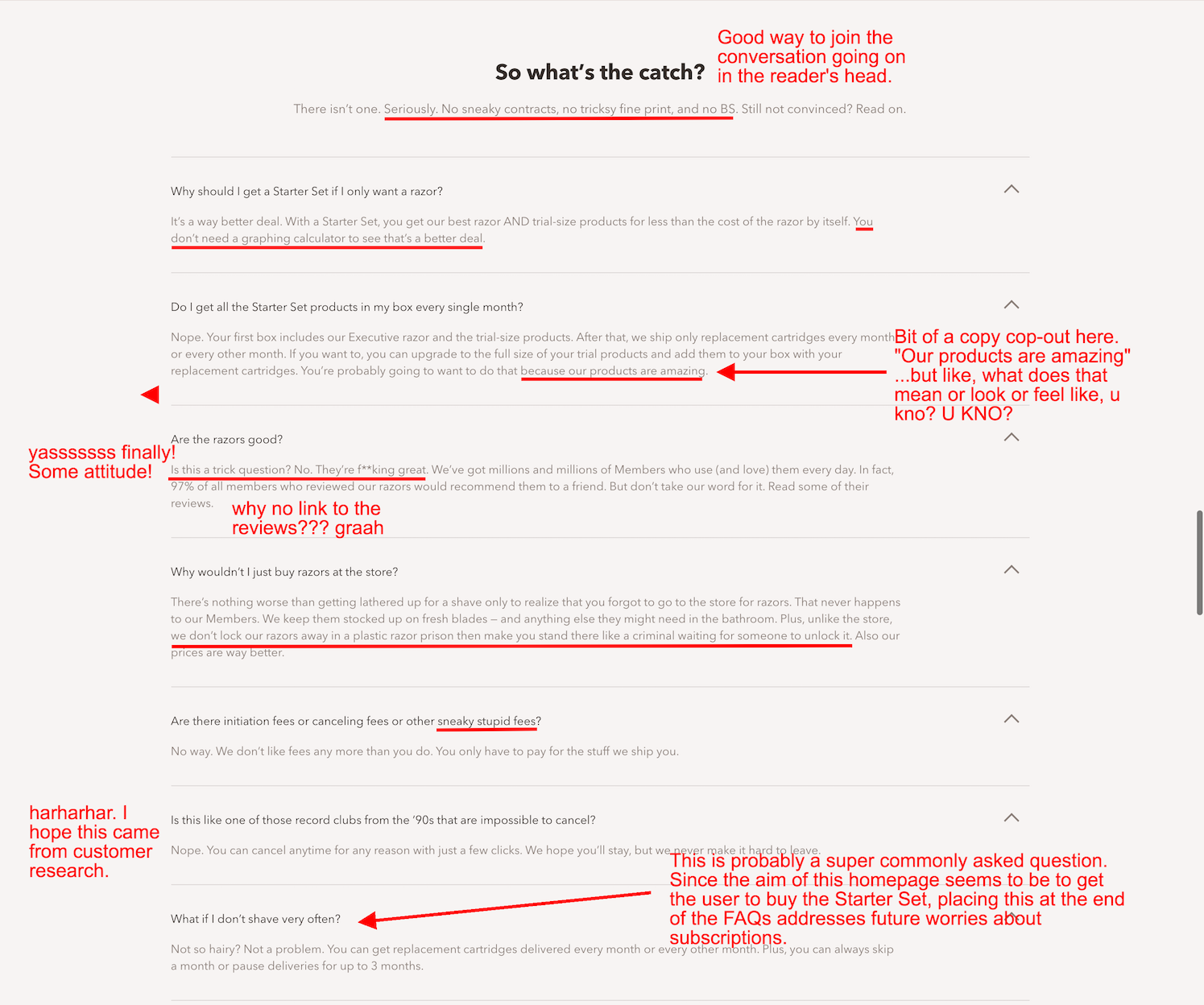
Aha! LOOK THERE! A headline written from the user’s point of view! Thank glob.
We’ve finally reached the point where the copywriter(s) who wrote this page were allowed to start having some real fun. Either that, or they started drinking.
It’s been about 8 years. Time for another Mad Men GIF.
The way these FAQs are written is the tone we’ve WANTED from DSC, the tone they HINTED at throughout this page, dangled, and then snatched away.
Oh, to savor this major tone shift now, in the expanded accordion FAQ section! So far down the page!
Why? If someone has read this far, chances are they’re open to copy that takes a few more risks in trying to get their attention. Plus, the extra-sassy copy in some spots will feel like a reward to careful readers.
TL;DR
Throughout the page, Dollar Shave Club graaaadually introduces humor into its copy. It gets fully up to its normal, buoyant self by the very bottom. DSC takes the conservative approach to homepage humor, and I get that.
Unfortunately, the last CTA comes in like a wet fart, with an extra line that makes the ‘Club look more anxious than confident. But hey, sometimes all you need is a good editor.

What do y’all think of this page?
And whose copy should I tackle next?


9 Comments
-

-

-

-

-

-

-

-

-
